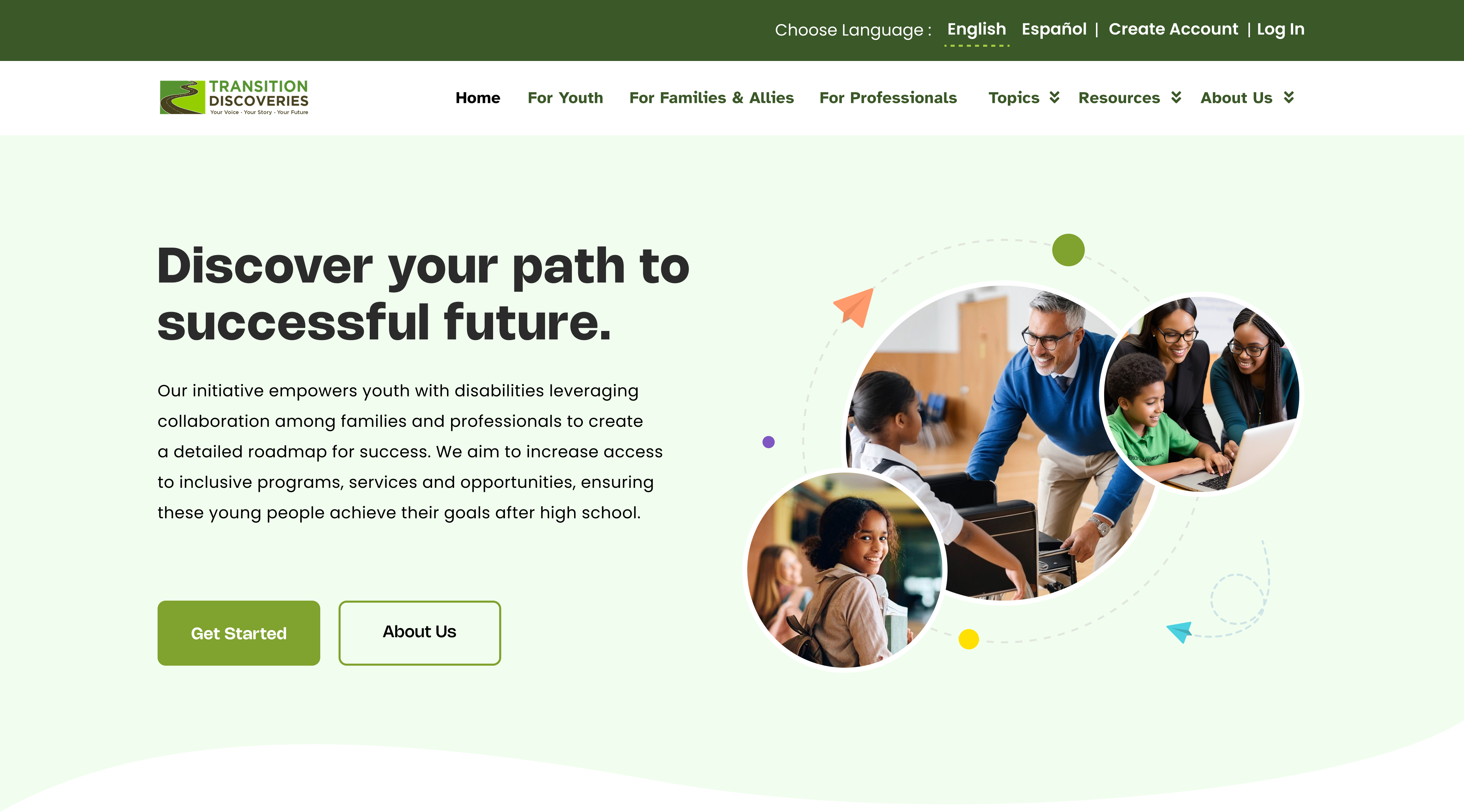
What is Transition Discoveries?
Transition Discoveries is a nonprofit focused on aiding youth with disabilities — aged 13 to 20 — in transitioning from high school to higher education and employment. The platform aims to provide clear, navigable, and engaging content tailored to the unique needs of each user, so that youth feel supported and confident in their progression.
Our team of four product designers was brought in through Indiana University's Capstone program to conduct end-to-end research and redesign — from generative research through high-fidelity delivery. The project earned the Best Project in Show award at the IU Capstone 2024 showcase.
What obstacles was Transition Discoveries facing?
who are transitioning from high school to higher education or work — a highly varied and underserved audience.
Enhance the website to offer clear, navigable, and engaging content that works for users with varied disabilities.
Address the unique needs of each user so they feel supported and confident in their educational and career progression.
"How might we ensure that the platform becomes a catalyst for a confident and supported transition experience for youth with disabilities?"
How did we transform user needs into an effective solution?
A multi-phase research-to-design pipeline spanning 16 weeks — from literature review through final high-fidelity delivery.
Tracing the route to the solution
Heuristic Evaluation
Identified key usability issues and improvements aligned with Nielsen's 10 usability heuristics.
↳ Elements that follow industry standards users can understand without explicit prompts.
↳ Redesign layout using industry standards with uniform, properly aligned graphical elements.
↳ Remove the redundant search input. Simplify to a single minimal design.
↳ Refine the algorithm to distinguish skipped vs. completed views for accurate tracking.
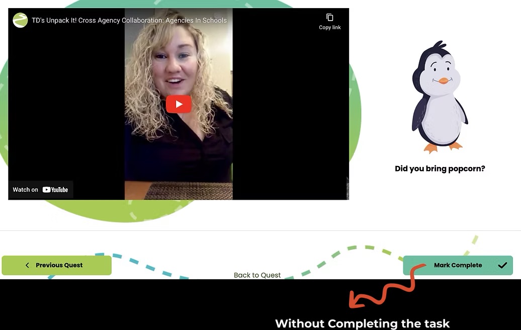
Think Aloud Sessions
Measuring effectiveness and efficiency metrics to evaluate the performance of the website.
Young participants with disabilities performed a cognitive walkthrough of the platform.
Each participant completed 5 tasks and responded to structured follow-up questions.
Data converted into quantitative effectiveness and efficiency metrics.
Tackling the challenges through design
Three core pinpoints identified through research, each addressed with a targeted design solution.
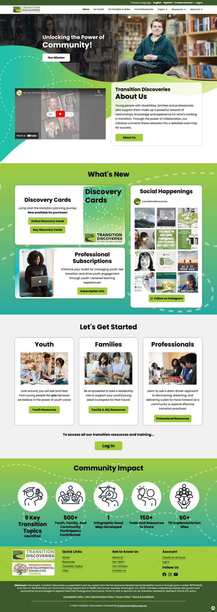
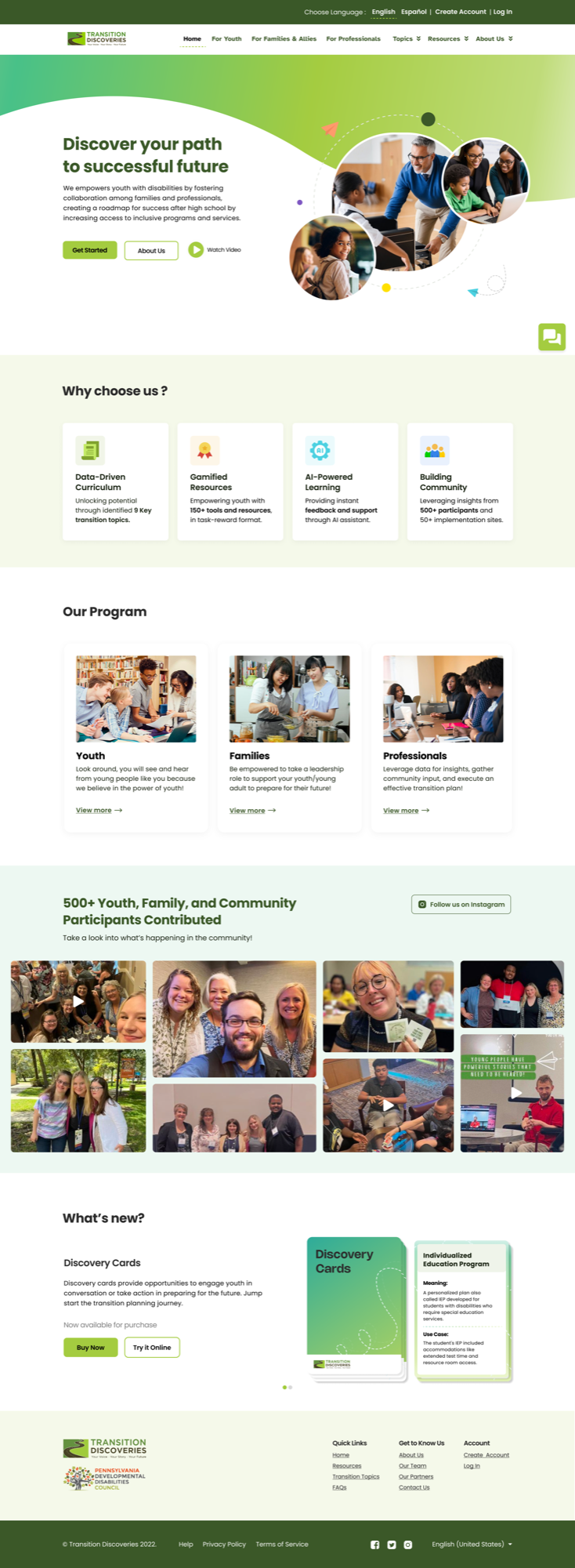
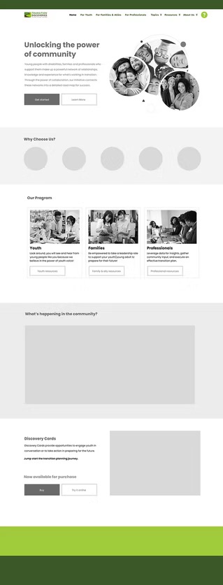
Simplifying the Homepage
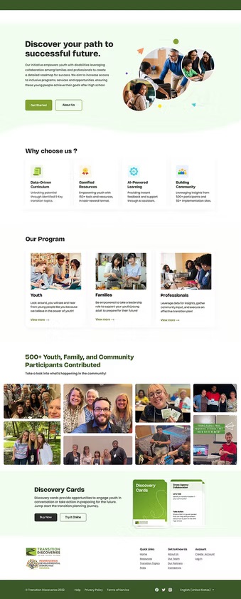
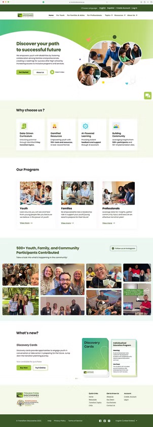
The homepage had a cluttered layout and overlapping visual elements — straining for users with varied disabilities and reducing conversion rates.
Simplified the page to surface only essential information, added a clear CTA, integrated an AI chatbot, and restructured community messaging to communicate value faster.
- →CTA button added to streamline the decision-making process
- →AI chatbot integrated for on-site assistance
- →Community impact reframed as 'why choose us' at top
- →Event images surfaced to foster community building
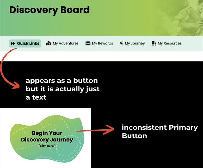
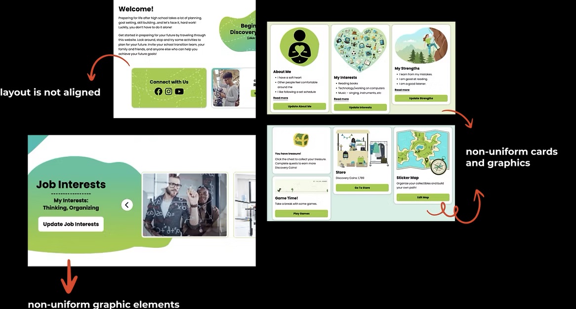
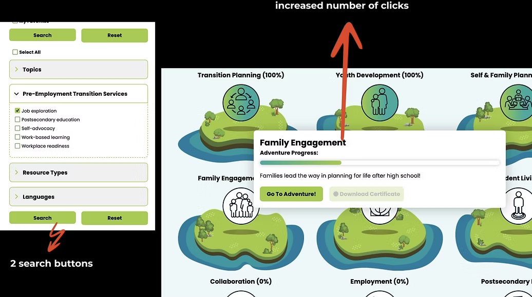
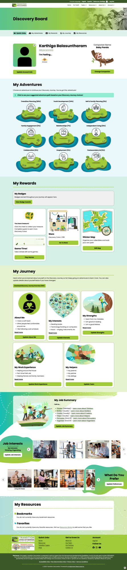
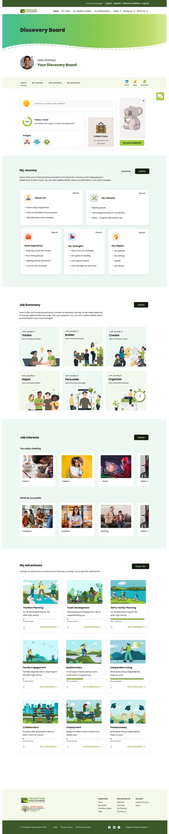
Redesigning the Discovery Board
The discovery board's complex, inconsistent layout complicated navigation for youth with disabilities. No motivational or engaging elements existed to sustain interaction.
Improved visual hierarchy, restructured information by function, and added Goals, Badges, and a Forum for motivation and peer collaboration.
- →Badges, coins, and accessory store promoted to top
- →Added 'today's goal' feature for daily motivation
- →Modules reformatted as cards with progress bars
- →Revamped journal and job summaries with illustrations
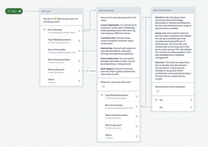
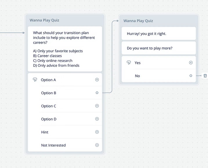
Introducing AI-Driven Learning Tools
Clients needed AI-driven motivational features and tools to foster collaboration among peers and mentors — none of which existed.
Transformed the existing companion into an AI chatbot, added a floating notes board for in-module capture, and built a mentor-facilitated collaborative forum.
- →Teaching-oriented AI chatbot: summaries, definitions, quizzes
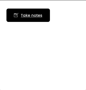
- →Floating note board for quick in-module capture
- →Collaborative forum for peer and mentor discussions
- →Workflows accelerated 1.5×, satisfaction up 53%
How we iterated and delivered
A glimpse of how concepts were validated with client feedback and shipped as final designs.
Revamped the Website
Applied all concepts in low-fidelity first to validate ideas and gather client feedback. Clients loved the redesign but were particular about staying true to their recently launched brand identity. The final delivery was a decluttered, organized homepage that matched their visual language.
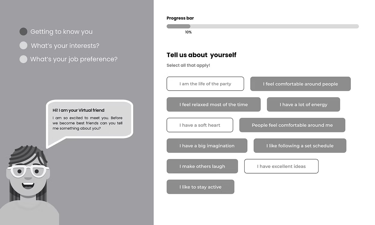
Streamlined Onboarding
The onboarding process was restructured into three distinct parts with a two-column layout to minimize scrolling. A progress bar was added for status awareness, and supporting text clarified the purpose of each data input field.
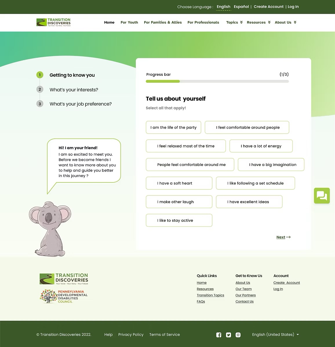
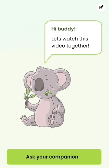
Introduced AI Chatbot
Transformed the client's existing companion element into an AI-powered conversational guide. Early user feedback flagged small text causing cognitive strain — container and font sizes were scaled up significantly in the final iteration.
How has this experience contributed to my growth?
Every design decision was backed by research and aligned to client goals. When opinions diverged, research served as the neutral arbitrator that kept the team and client aligned.
Regular check-ins surfaced blockers early and kept feedback loops tight throughout the year-long engagement — no surprises at final delivery.
Working with a team of four taught me to communicate design intent clearly across different working styles, especially when discussing feasibility of proposed solutions.
Unless tasked with a rebrand, established brand elements must be respected. The client's recent brand launch was non-negotiable — and that constraint ultimately made the design stronger.
DESIGNING FOR THOSE WHO DESERVE BETTER ACCESS
This project is live and serving youth with disabilities across the United States.